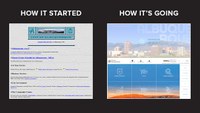
City Website, Main Entry Point to City Services and Information, Gets User-Friendly Re-Design
December 10, 2020
The City of Albuquerque Department of Technology and Innovation (DTI) announced the launch of a redesigned website today, built to ensure ease of use at a site that serves as the entry point and first stop for many people looking for information or services from the City. The website now offers a topic-based homepage, consistent functionality across departments, and an innovative design. These improvements help create a better user-experience and allow users to more easily find information.
The City’s website provides convenience for Albuquerque residents and promotes government transparency. Users can use the website to report issues, learn about their local government, seek help, find things to do or ways to stay involved in the community, and more easily conduct business with the City of Albuquerque.
“This pandemic brought to light more than ever how important communication is between City Hall and our residents,” Mayor Tim Keller said. “Having access to accurate information is critical during these fast changing times. Now it’s easier to find for the 10 million people a year who visit our website looking at whether the BioPark is open, where to get meals for seniors, how to apply for small business grants, or legislation being considered at City Council meetings.”
The City’s website receives more that 10 million visits per year and houses information across thousands of pages. The website is a portal for users to interact with the City and the people who work for them.
“Our mission at DTI is to make local government accessible and easy to navigate, from 311 to the website and apps that people use every day to get what they need from City Hall,” said Brian Osterloh, Director of Technology & Innovation. “The new website will help us meet that mission and will be constantly updated to keep everyone informed and engaged.”
The City worked with local Albuquerque company Paper Plane Branding & Marketing to create a design that could incorporate a wide range of content, from government reports to volunteer sign-up forms and more, in one unified site.
"Our approach to this project was to create a design with the purpose of improving the user experience and addressing previous sticking points with the old websites functionality,” said Jessica Gentry, CEO of Paper Plane Branding and Marketing. “The new website ties together a robust amount of information along with visuals - not only with beautiful images of our City - but with custom icons and the incorporation of the One Albuquerque brand with individual department colors. The collaboration with the City’s IT team was an amazing experience and we are grateful for the opportunity.”

